Publiactions / Awards
Awards
Caterpillar Megamall
1st
Architecture and construction magazine - 2014 [no. 36]
Download PDF ➝
www.caoi.ir ➝
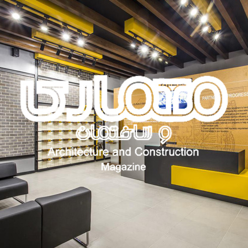
Caterpillar Inc. is the world’s leading manufacturer of mining and construction equipment...
Using its recognized CAT brand, the company also markets a wide range of heavy duty and safety footwear and accessories. Signifiers that can be associated with the company’s identity and products were used to design Caterpillar Shoe Shop at Megamal Commercial Center. Following the worldwide design of the Caterpillar stores, the ceiling’s structural and mechanical elements are exposed to create an industrial impression. To further emphasize the industrial spirit, exposed U-Channel profiles were used to hold the shelves on the walls. The use of yellow, grey and black colors reflect Caterpillar’s organizational color code. Such materials as perforated sheet metal and raw wood, as well as forms that are associated with mechanical elements like gearwheels were used to construct the interior of the shop.
Sam Center
Architecture and construction magazine - 2014 [no. 36]
Download PDF ➝
www.caoi.ir ➝
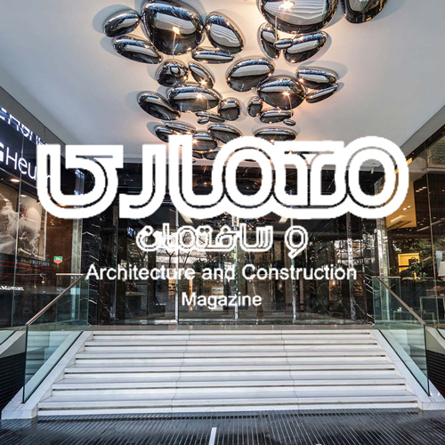
Sam Commercial Center was defined as a hub for high end clothing and accessories brands, and high quality food and leisure services...
The project consists of two floors of commercial space, five floors of parking and office area, a mezzanine level, and one floor dedicated to restaurants. The parking, mezzanine and restaurant levels are constructed on top of the commercial level to improve the property quality of the restaurants by providing uninterrupted view of the cityscape. The building has a double-skin façade, consisting of punched compact laminate on the exterior and masonry walls on the interior that covers the parking levels. Lighting in between the two skins is used to create the image of a “shining box” during the night. The sidewalk near the main entrance is designed with grey, coarse and grooved stone. The main entrance is emphasized with a wall fountain, shiny decorate lighting objects on the ceiling and glossy white stone that contrasts with the sidewalk. The guiding principles in designing the interior of this commercial space was: The project consists of two floors of commercial space, five floors of parking and office area, a mezzanine level, and one floor dedicated to restaurants. The parking, mezzanine and restaurant levels are constructed on top of the commercial level to improve the property quality of the restaurants by providing uninterrupted view of the cityscape. The building has a double-skin façade, consisting of punched compact laminate on the exterior and masonry walls on the interior that covers the parking levels. Lighting in between the two skins is used to create the image of a “shining box” during the night. The sidewalk near the main entrance is designed with grey, coarse and grooved stone. The main entrance is emphasized with a wall fountain, shiny decorate lighting objects on the ceiling and glossy white stone that contrasts with the sidewalk. The guiding principles in designing the interior of this commercial space was: 1- to provide optimal transparency and visibility of the shop fronts 2- to create appropriate identity of the project as a high end commercial space 3- to form a central interactive space that invites public presence, and can be used as an arena for public events. The spacious central lobby of the ground floor was formed by arranging the shops in an elliptical form. This central from of lobby provides clear visibility of the shop fronts from every angle. Also, structural elements are concealed, horizontal lines are avoided, and vertical lines are kept at a minimum to reduce distraction and visual noise from viewers’ eyes. The lobby of the restaurants is designed as a transitional space. People arriving and passing through this space experience a sense of illusion as a result of using reflective large blocks of black glass that appear suspending on a luminous surface. The luminous surface is a translucent glass skin which is lit from the back side with defused light.
Sam Cafe
Architecture and construction magazine - 2014 [no. 36]
Download PDF ➝
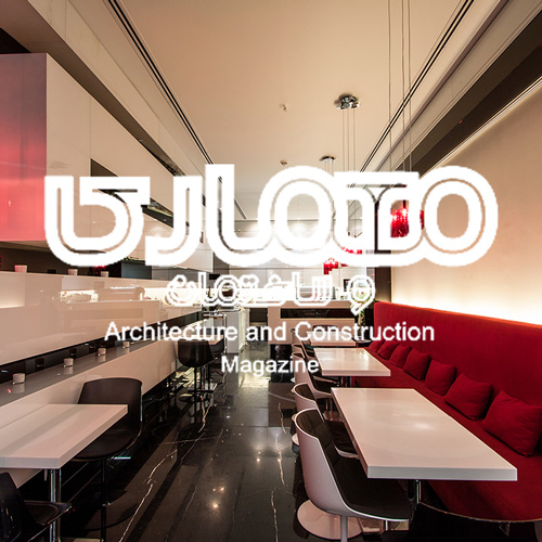
Sam Café is located within an exclusive shopping center (Sam Center) in Fereshteh St., Tehran...
The shop has a width and length of three and twelve meters. There are two main objectives in the interior design of this project: 1- Creating an interaction between the design of the coffee shop and the embodying site (i.e. the interior of the commercial center), 2- Improving the comfort of space by creating an impression of a wider and more spacious place. Parallel rectangular cuboids that stretch along the length of the coffee shop are the key elements in the design of Sam Café. Not only the cuboids provide a surface to place various decorative objects, but also they emphasize and deepen the perspective. Furthermore, making a smart choice of materials by using reflective glass to build the cuboids, helped to make the space appear wider and more comfortable. All materials on the walls, ceiling and flooring were chosen in black or white to have maximum harmony with the commercial center.
Publications
Shila Restaurant
Architecture and construction magazine - 2014 [no. 44]
Download PDF ➝
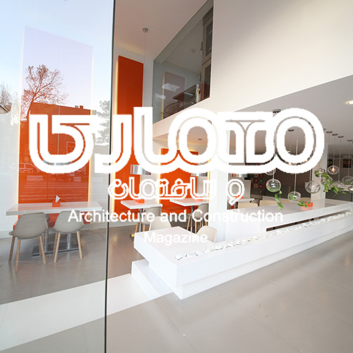
The primary goal of the project was to reach a replicable, expandable, and easily executable design for all the branches of the restaurant...
in addition to considering the target market- the middle class and young adults of the society. To reach these goals we used elements such as the color scheme of Shila restaurant, sphere lamps, light and portable furniture, as well as a greenery space. Among the main characteristics of the projects the functional divide of the spaces, and clarity are the most notable. As a result, the kitchen is located in a completely separate space, on the upper floor of the building in a way that it can be seen from the outside façade and the interior hall, and the cashier line-up space is separated from the seating area by a difference in the height level.
Tabriz Tile
Memar magazine - 2012 [no. 82]
www.memarmagazine.com ➝
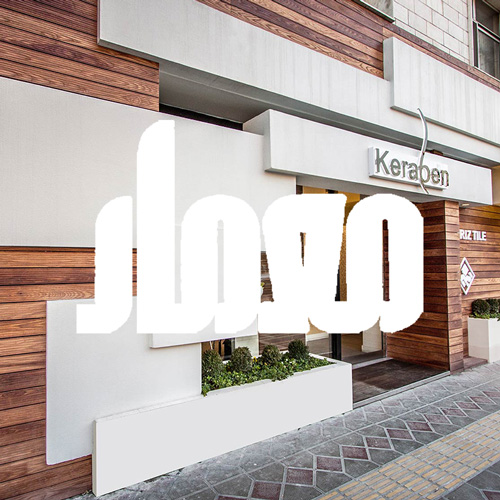
The idea and concept of this design is based on the main subject of the project: abstract use of tiles and ceramics in building facades...
We used white tiles in a variety of sizes, hanging on top of one another to symbolize this goal. The implementation of floating and overhanging cube modules required specific executional and material considerations, which in turn required a specific design of the details of the project. In the background we used wood to create a notable contrast between the unicolor and uniform background and the white overhanging tiles, and to fabricate a warm-looking façade. The specific way of designing this display, i.e. not using the typical window displays, distinguishes this store from the rest of the adjacent retail stores and has transformed the retail culture in all of Shirazi st. destrict
Sam Cafe
Mehraz magazine - 2014 [no. 4]
donwload PDF ➝
www.mehrazmagazine.com ➝
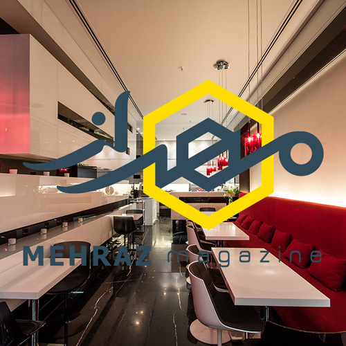
Sam Café is located within an exclusive shopping center (Sam Center) in Fereshteh St., Tehran...
The shop has a width and length of three and twelve meters. There are two main objectives in the interior design of this project: 1- Creating an interaction between the design of the coffee shop and the embodying site (i.e. the interior of the commercial center), 2- Improving the comfort of space by creating an impression of a wider and more spacious place. Parallel rectangular cuboids that stretch along the length of the coffee shop are the key elements in the design of Sam Café. Not only the cuboids provide a surface to place various decorative objects, but also they emphasize and deepen the perspective. Furthermore, making a smart choice of materials by using reflective glass to build the cuboids, helped to make the space appear wider and more comfortable. All materials on the walls, ceiling and flooring were chosen in black or white to have maximum harmony with the commercial center.